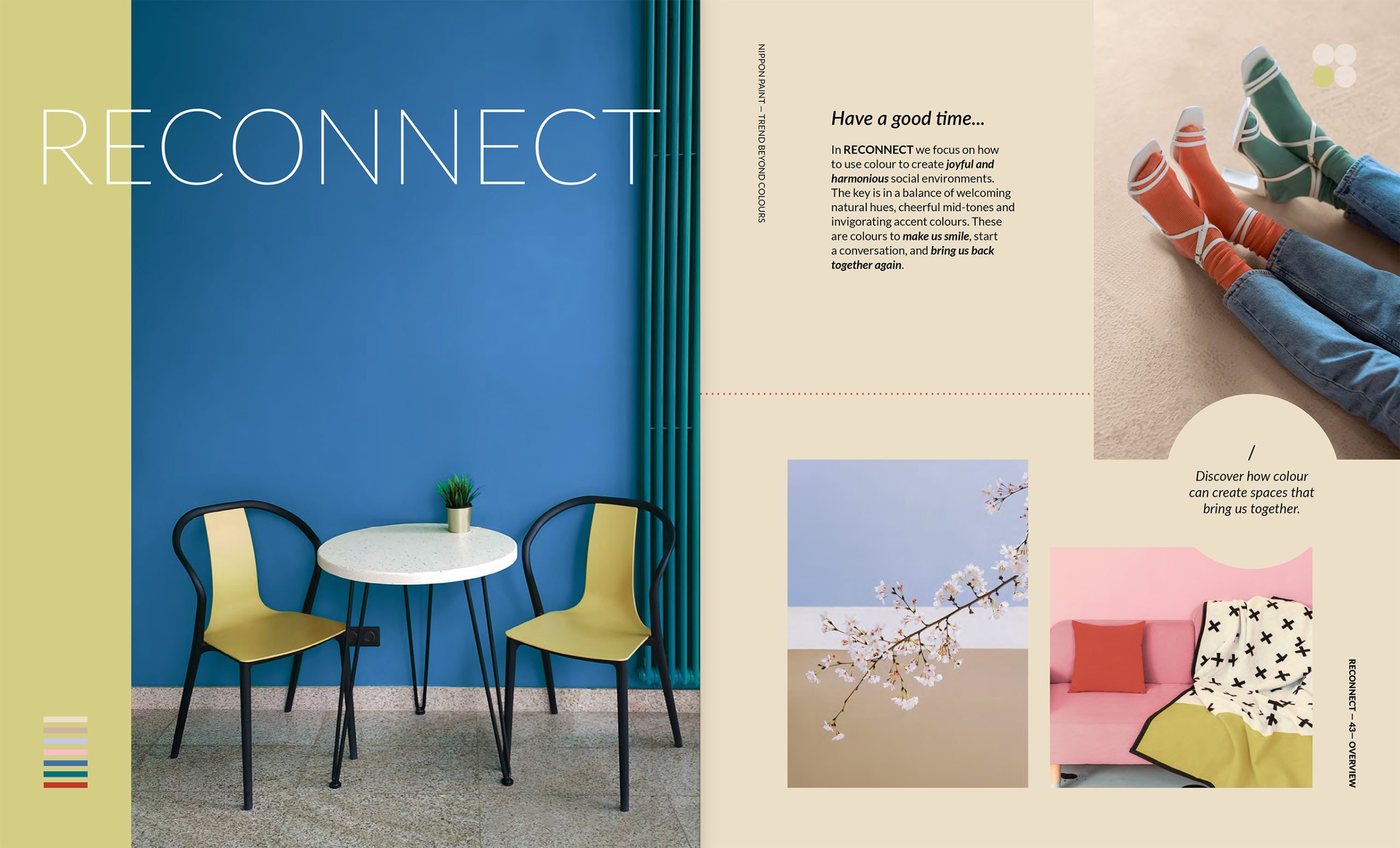
RECONNECT
Have a good time...
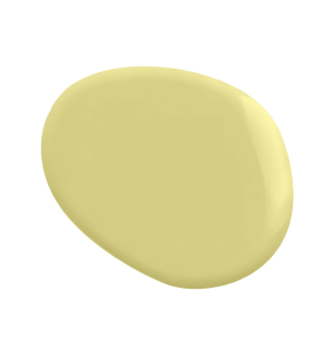
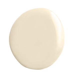
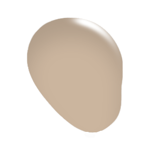
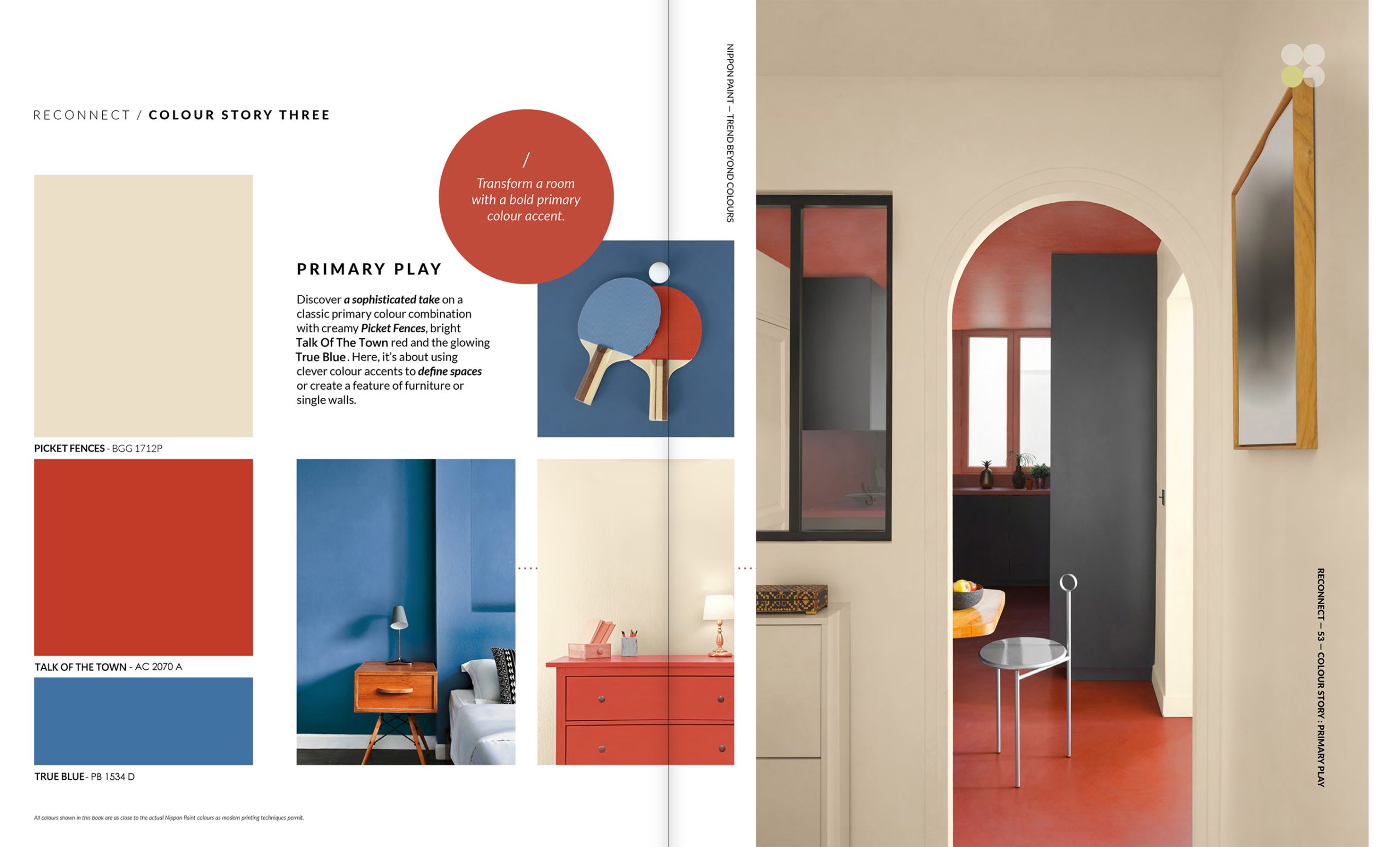
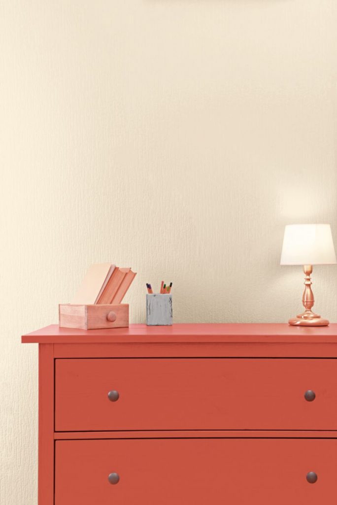
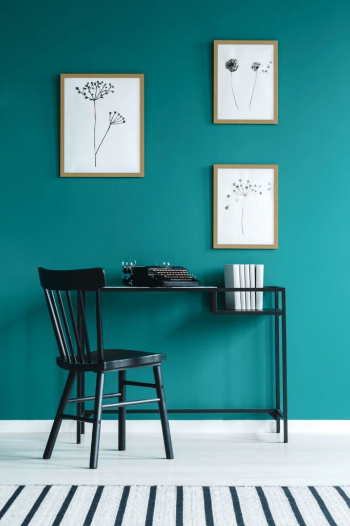
In RECONNECT we focus on how to use colour to create joyful and harmonious social environments. The key is in a balance of welcoming natural hues, cheerful mid-tones and invigorating accent colours. These are colours to make us smile, start a conversation, and bring us back together again.
Space which cultivates Restoration
Previous
Next
Previous
Next
SPECIAL FEATURE: Interactive spaces
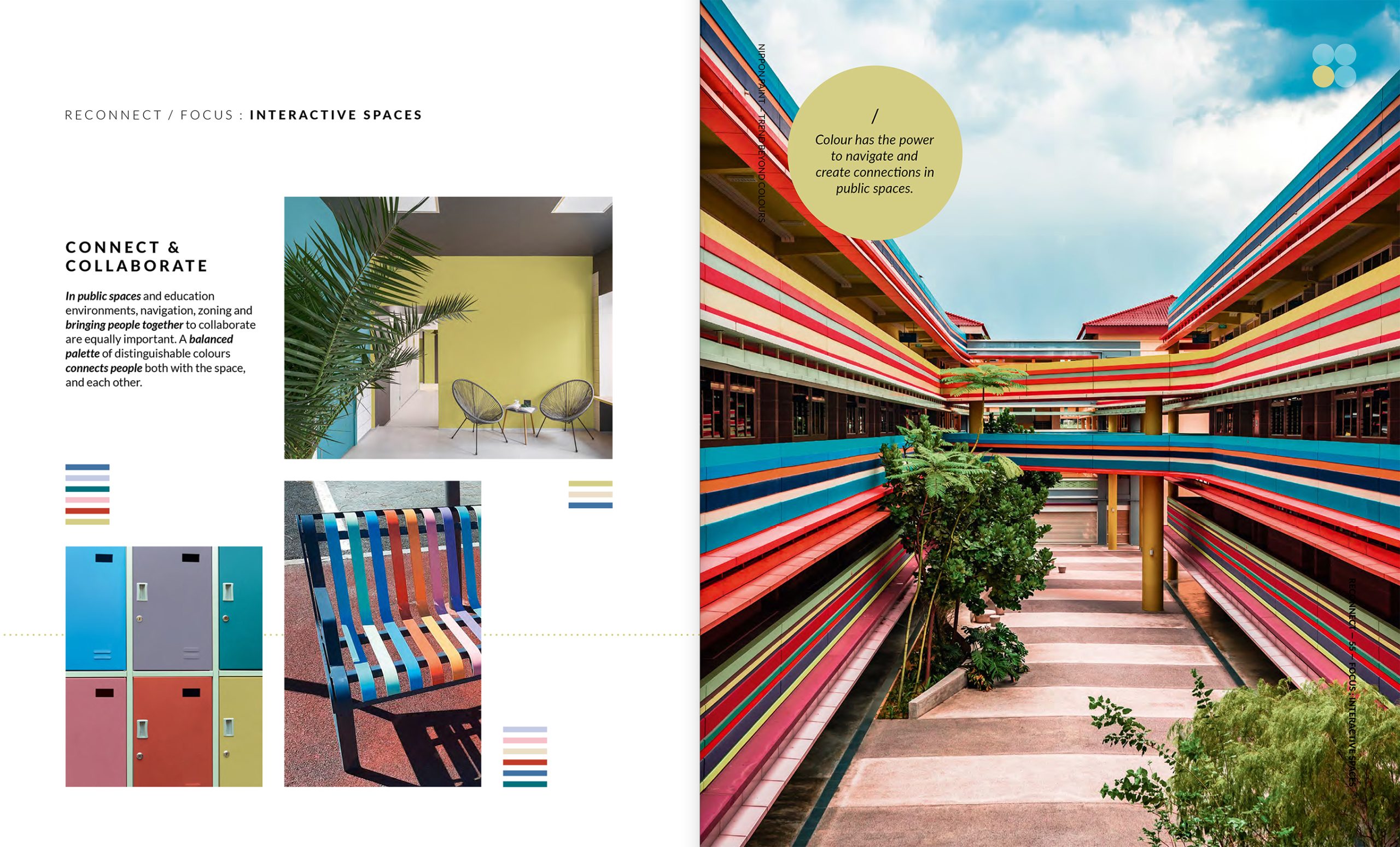
CONNECT & COLLABORATE
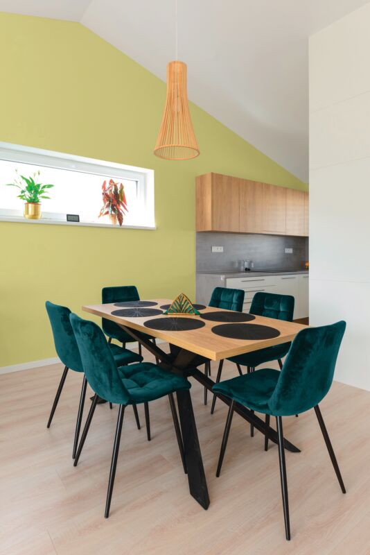
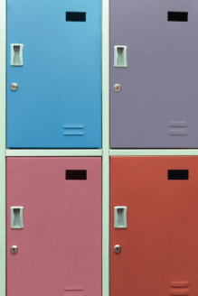
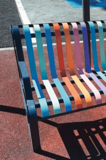
In public spaces and education environments, navigation, zoning and bringing people together to collaborate are equally important. A balanced palette of distinguishable colours connects people both with the space, and each other.
EXPLORE
Interior
Select a colour and click on the walls to visualise it.
COOL NEUTRAL
WARM NEUTRAL
YELLOW
ORANGE & RED
GREEN
PURPLE & BLUE
MOMENTO
Selected colours
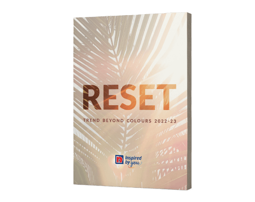
Nippon Paint’s RESET helps us align colours that resonate with our state of mind perspectives of the world.
Explore our RESET inspirations and colour palettes
